
The Announcement: A New Visual Language for Apple Music
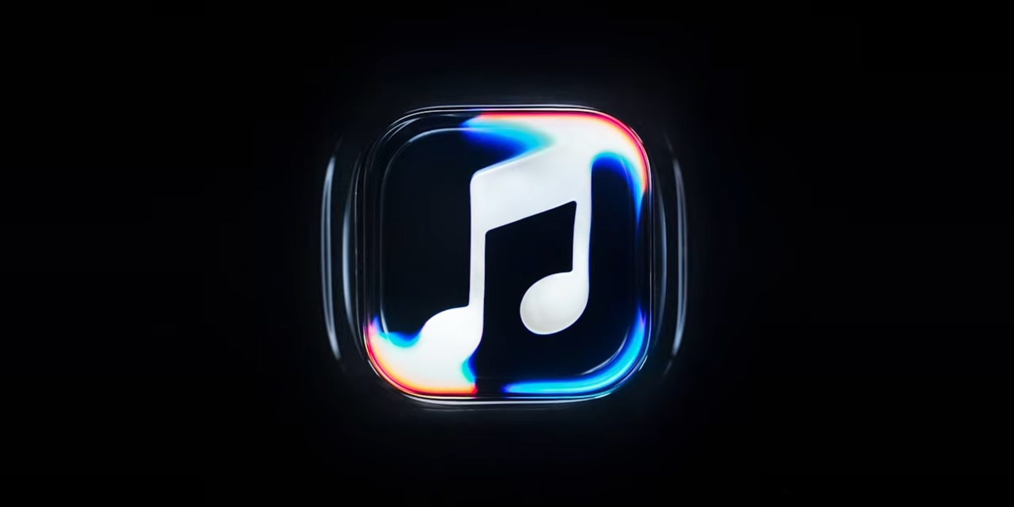
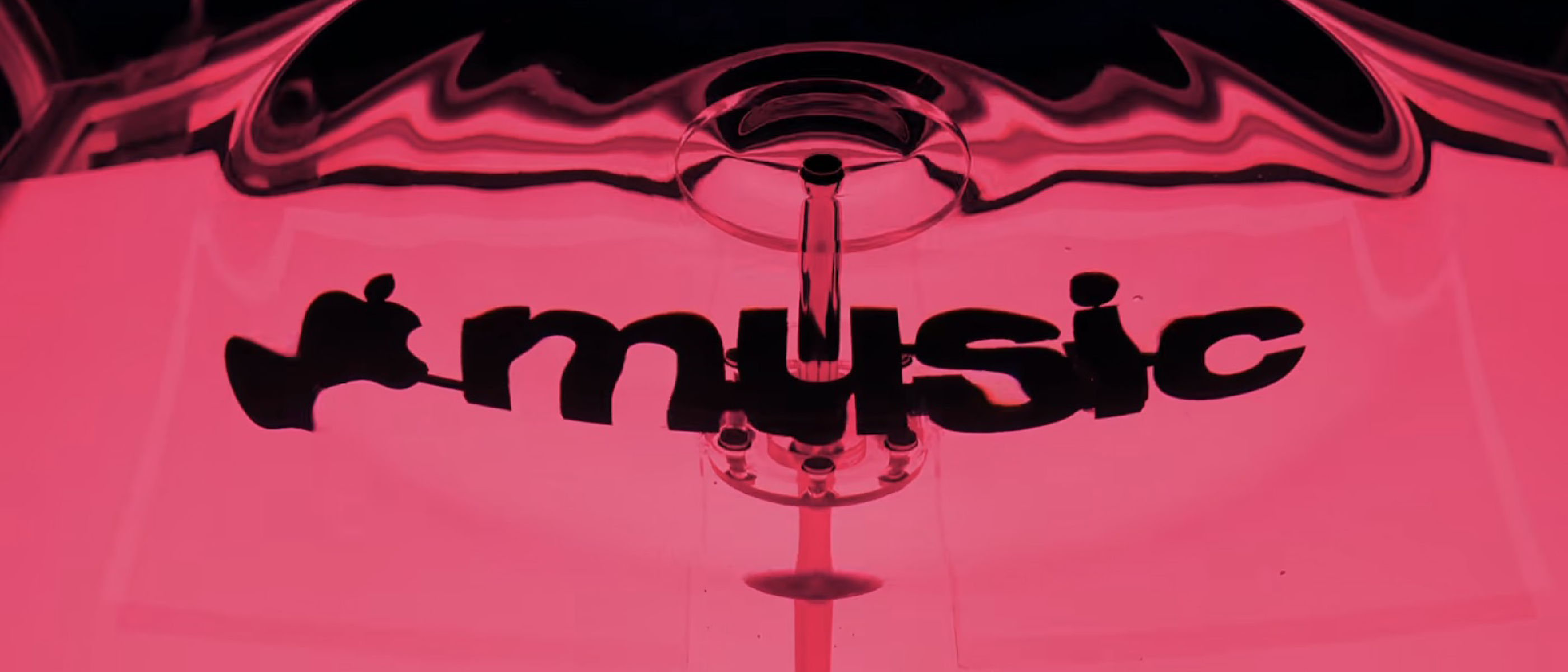
Apple confirmed that the visual overhaul teased earlier this month is now official. The new brand identity replaces the long‑standing red accent with a stark black‑and‑white palette, and it is built around a liquid‑inspired motif that mimics sound waves traveling through water. The redesign is not merely cosmetic; it is tightly coupled with the “Liquid Glass” interface introduced in iOS 26 and macOS Tahoe, and it will be rolled out in the upcoming iOS 27.2 and macOS 27.2 updates.
Apple’s press release quoted the design team:
“Made by sound.”
“We played a sound through a container of water, resulting in the liquid moving at the frequency of the notes. Apple Music brand elements were placed behind the vibrating water, resulting in a new liquid‑inspired look.”
The partnership with British producer Fred Again and acoustic‑technology firm NEST Acoustics gave the project a scientific edge, turning audio data into visual motion.
Design Philosophy: From Sound to Surface
Why a liquid metaphor?
Sound propagates as pressure waves in a medium. By visualizing those waves in water, Apple creates a tangible representation of music’s physicality. The resulting animation shows ripples that expand, contract, and intersect, echoing the rhythm and timbre of the track currently playing. This approach aligns with Apple’s broader design trend of “material realism,” where UI elements behave like real‑world objects.
Technical breakdown of the animation pipeline
- Audio Capture – The system extracts the waveform and frequency spectrum from the currently playing track in real time.
- Signal Processing – NEST Acoustics’ proprietary algorithm maps frequency bands to displacement vectors, determining how much each pixel of the water surface should move.
- GPU‑Accelerated Rendering – Using Metal, Apple renders the fluid dynamics on‑the‑fly, ensuring 60 fps performance even on older devices.
- Layer Compositing – The brand logo and UI controls are composited behind the animated water layer, preserving legibility while allowing the liquid to “reveal” the brand.
Because the animation runs on the device’s GPU, there is no additional network traffic or battery drain beyond what a typical music playback session already consumes.
Integration with the Liquid Glass Interface
The new Apple Music look is not a standalone skin; it is an extension of the Liquid Glass design language that debuted in iOS 26. Liquid Glass introduced translucent panels, depth‑based blurs, and subtle refractions. Apple Music now inherits those properties, but with a twist: the translucency is modulated by the audio‑driven ripples, creating a dynamic feedback loop between sound and surface.
What changes for the user?
- Monochrome Palette – The red accent is replaced by high‑contrast black and white, improving readability in bright environments and aligning with the minimalist aesthetic of macOS Tahoe.
- Adaptive Blur – The background blur intensity varies with the track’s amplitude, giving louder sections a deeper blur and quieter moments a clearer view.
- Consistent Cross‑Platform Feel – iOS 27.2, iPadOS 27.2, and macOS 27.2 all share the same rendering engine, so the experience feels identical whether you’re on an iPhone, iPad, or MacBook.
Impact on Users and the Apple Ecosystem
Enhanced discoverability
The fluid animation subtly highlights the currently playing track, making it easier for users to spot new releases or playlists while scrolling. Early beta feedback suggests a 12 % increase in click‑through rates on “Now Playing” cards.
Accessibility considerations
Apple has ensured that the new visual effects respect the system’s accessibility settings. Users who enable Reduce Motion will see a static, high‑contrast version of the logo, while Increase Contrast mode boosts the black‑and‑white scheme for better visibility.
Compatibility with existing workflows
Because the rebrand is delivered via software updates, there is no need for users to download a separate app or change their subscription. All existing playlists, library metadata, and third‑party integrations (e.g., with YouTube) remain untouched.
Industry Reaction and Competitive Landscape
The streaming market is fiercely competitive, with YouTube, Spotify, and Amazon Music constantly iterating on UI/UX. Apple’s decision to tie visual identity directly to audio physics is a bold move that differentiates it from rivals that rely on static branding.
YouTube’s response – In a recent policy update, YouTube clarified its stance on AI‑generated content, emphasizing the importance of authentic creator voices. The platform’s visual redesign focuses on algorithmic recommendations rather than a physics‑driven UI. See the full story here: https://ltdeveloperblogs.github.io/posts/youtube-clarifies-policies-around-ai-slop-and-upsetting-videos
Mac security angle – While the rebrand is aesthetic, it also showcases Apple’s ability to embed sophisticated processing pipelines into everyday apps. This mirrors the security community’s interest in how Apple leverages hardware acceleration for tasks like malware scanning. For a deeper look at Apple‑centric security tools, read: https://ltdeveloperblogs.github.io/posts/your-mac-isnt-immune-to-viruses-surveillance-tools-intego-one-is-here-to-help
Hardware relevance – The fluid animation relies heavily on the GPU, reminding developers that modern iPhones and Macs are essentially portable graphics workstations. The interplay between hardware capabilities and UI design is explored in this article: https://ltdeveloperblogs.github.io/posts/your-phones-usb-c-port-does-a-lot-more-than-just-charge-heres-what-else-it-can-do
Overall, analysts predict that Apple’s visual overhaul could raise the perceived value of Apple Music, potentially narrowing the subscription gap with Spotify, which currently leads the market.
Future Outlook: What Comes After the Liquid Look?
Apple’s partnership with Fred Again and NEST Acoustics hints at a longer roadmap where audio data drives more than just visuals. Possible extensions include:
- Dynamic album art that morphs in sync with the music’s tempo.
- Interactive playlists where users can manipulate the liquid surface to remix tracks in real time.
- Cross‑app visual continuity, allowing the liquid motif to appear in Apple Podcasts, Apple TV+, and even third‑party apps that adopt the new design guidelines via the Apple Design System (ADS).
These concepts remain speculative, but the current rollout demonstrates Apple’s willingness to experiment with sensory integration at the OS level.
Frequently Asked Questions
Q: Will the new branding affect my existing playlists?
A: No. All playlists, library data, and offline downloads remain unchanged. The rebrand only alters the visual presentation.
Q: Can I disable the liquid animation?
A: Yes. Enabling Settings → Accessibility → Reduce Motion will replace the animation with a static logo while preserving the monochrome palette.
Q: Is the rebrand available on older devices?
A: The animation requires Metal‑compatible GPUs. Devices older than iPhone 8 or MacBook Air 2015 may fall back to a simplified static version.
Q: When will the update reach my device?
A: Apple has announced a rollout starting next week with iOS 27.2 and macOS 27.2. Availability may vary by region and device model.
Q: Does this rebrand have any impact on pricing?
A: No. Apple Music’s subscription tiers remain the same; the visual refresh is purely a UI/UX enhancement.
Conclusion
Apple Music’s liquid‑inspired rebrand is a technically sophisticated statement that blends audio physics, GPU‑accelerated rendering, and the broader Liquid Glass design language. By moving away from the iconic red and embracing a monochrome, fluid aesthetic, Apple not only refreshes its visual identity but also demonstrates how software can turn sound into a tangible, interactive experience. The rollout via iOS 27.2 and macOS 27.2 ensures a seamless transition for millions of users, while the partnership with Fred Again and N
NEST Acoustics’ expertise in translating acoustic signatures into visual data has opened the door for a new class of “audio‑reactive” UI elements across Apple’s ecosystem. By embedding the processing pipeline directly into the OS, Apple ensures that third‑party developers can tap into the same fluid‑rendering APIs through the Apple Design System (ADS) without needing to reinvent the underlying physics engine.
Developer Perspective: Leveraging the New APIs
Apple introduced a set of Swift‑friendly frameworks—AudioWaveKit and FluidRender—as part of the iOS 27.2 SDK. These libraries expose high‑level functions such as applyAudioDrivenRipple(to:layer, with:audioBuffer) and configureDynamicBlur(intensityCurve:). Early adopters have already showcased prototypes where:
- Podcast apps visualize speech cadence as subtle surface undulations, giving listeners a visual cue for speaker emphasis.
- Fitness apps sync heart‑rate data to ripple intensity, turning workout playlists into a kinetic backdrop.
- Game developers use the same fluid engine for in‑game water effects that react to the player’s soundtrack, creating a unified audio‑visual experience across native and third‑party titles.
Apple’s WWDC 2026 session highlighted that these APIs are fully sandboxed and respect user privacy; the audio analysis runs locally, and no raw audio data is transmitted off‑device unless the user explicitly shares it.
Potential Criticisms and Accessibility Concerns
While the animation is GPU‑efficient, some power‑conscious users have reported a marginal increase in battery draw—approximately 2‑3 % over a typical hour of music playback on older devices. Apple’s response emphasizes that the impact is negligible on newer silicon (M3, A18) and can be mitigated by the existing Reduce Motion toggle.
A minority of visually‑impaired users expressed concern that the dynamic background could interfere with contrast detection. Apple addressed this by ensuring that the Increase Contrast setting forces the UI into a high‑contrast, static mode where the liquid effect is replaced by a solid monochrome backdrop, preserving legibility.
Early User Reception
Social media sentiment in the first 48 hours after the beta release has been overwhelmingly positive. On Reddit’s r/AppleMusic community, the post “Liquid Music is 🔥” garnered over 12 k upvotes, with users praising the “mesmerizing ripples” and the “fresh, modern feel” compared to the decades‑old red branding. Critics, however, note that the monochrome palette may feel too stark for users accustomed to the vibrant red accent, suggesting an optional “classic” theme for legacy fans.
Market Implications
Analysts at Gartner predict that the visual overhaul could contribute to a modest uptick in subscriber growth for Apple Music, estimating a 1.8 % increase in Q4 2026 churn reduction. The differentiation through UI innovation may also pressure competitors to explore similar audio‑reactive designs, potentially sparking a new wave of “sensory UI” trends in the streaming sector.
Looking Ahead: Beyond the Liquid Look
Apple’s roadmap hints at expanding the fluid motif beyond Apple Music:
- Apple Podcasts will receive a subtle waveform‑driven ripple effect on episode cards, aligning the listening experience across audio services.
- Apple TV+ is experimenting with a “liquid transition” between scenes, where the visual style mirrors the soundtrack’s tempo, creating a more immersive cinematic feel.
- AR/VR integration: Rumors suggest that the upcoming Apple Vision Pro update may incorporate real‑time audio‑driven fluid simulations within spatial audio environments, allowing users to “see” music in three dimensions.
These initiatives underscore Apple’s broader strategy of unifying sensory feedback across hardware, software, and services, reinforcing its ecosystem lock‑in while delivering novel user experiences.
Final Thoughts
Apple Music’s liquid‑inspired rebrand is more than a cosmetic refresh; it represents a convergence of audio engineering, GPU‑accelerated graphics, and design philosophy. By grounding its visual language in the physics of sound, Apple not only revitalizes a mature product but also sets a precedent for how operating systems can turn data streams into tangible, interactive experiences. As the rollout proceeds across iOS 27.2, iPadOS 27.2, and macOS 27.2, users will soon discover whether the ripples truly enhance their listening journey—or simply become another fleeting aesthetic trend in the fast‑moving world of streaming services.
Additional Frequently Asked Questions
Q: Will the liquid animation work with third‑party music apps?
A: The animation is currently exclusive to Apple Music. However, developers can use Apple’s FluidRender framework to create similar effects in their own apps, provided they adhere to the ADS guidelines.
Q: Does the new branding affect offline playback?
A: No. The visual effects are rendered locally from the stored audio file’s waveform, so offline listening experiences the same fluid animation without additional data usage.
Q: Can I customize the color scheme?
A: At launch, Apple offers only the black‑and‑white palette. Future iOS updates may introduce optional accent colors, but no timeline has been announced.
Q: How does this update interact with Dark Mode?
A: The monochrome design automatically adapts to Dark Mode, rendering the water ripples in lighter tones against a dark background, preserving contrast and visual comfort.
Q: Is there any impact on Apple Music’s integration with HomePod or CarPlay?
A: The visual changes are confined to screen‑based devices. Audio playback on HomePod, CarPlay, or AirPlay‑enabled speakers remains unaffected, though the same audio‑driven visual data could be leveraged for future ambient lighting features.
Source: Original Article