


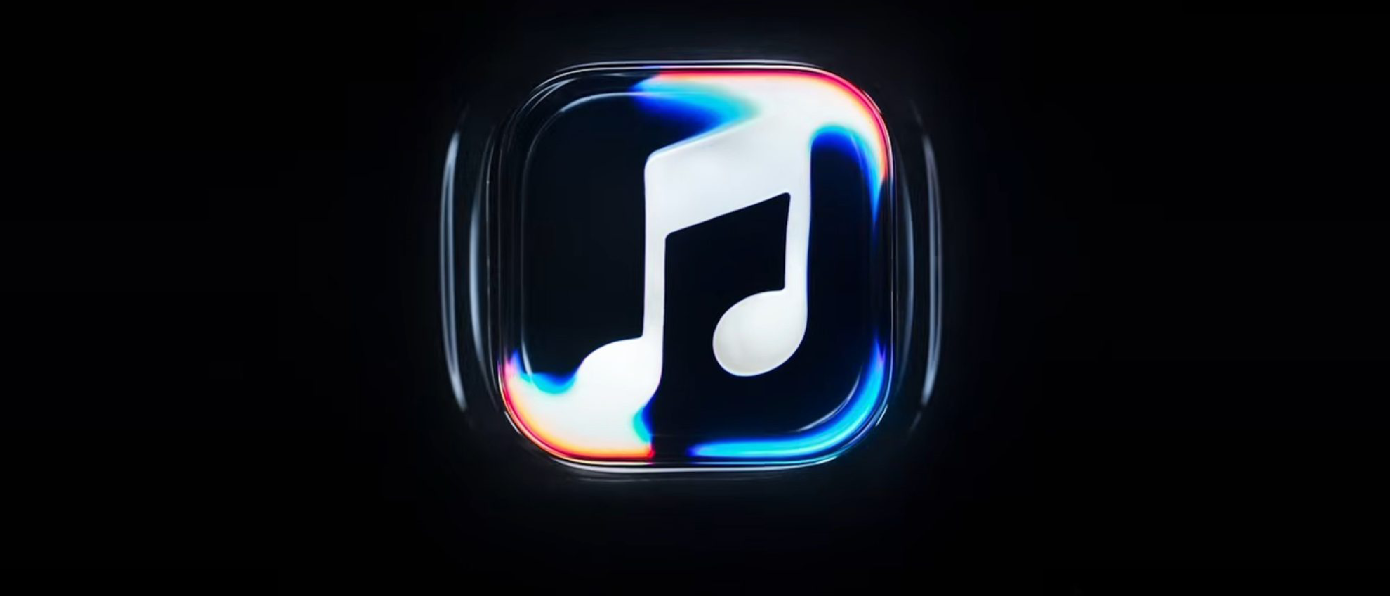
Why the New Logo Matters
Apple’s brand is built on a delicate balance between minimalism and unmistakable recognition. When Apple Music introduces a logo described as “made by sound,” it signals a deliberate shift toward a more auditory‑centric identity. This isn’t merely a cosmetic tweak; it reflects Apple’s intent to reinforce the core value proposition of its music service—sound itself. By embedding sonic elements into the visual brand, Apple positions Apple Music as the definitive platform where audio quality and user experience converge.
For consumers, a refreshed logo can rekindle interest and signal that the service is evolving. For competitors, it sets a new benchmark: if Apple can successfully merge sound and visual identity, other streaming giants may feel pressured to rethink their own branding strategies. The rebrand also aligns with Apple’s broader ecosystem, where hardware, software, and services are tightly interwoven. A sound‑based logo hints at deeper integration with Apple’s audio hardware, such as the latest AirPods and HomePod, creating a cohesive narrative across devices.
Industry Impact
Apple’s influence on design trends is well‑documented. The introduction of a sound‑inspired logo may prompt a ripple effect across the streaming industry. Other services might adopt similar visual cues—think waveform‑styled icons or dynamic logos that react to audio playback. This could lead to a new wave of “audio‑aware” branding, where logos are not static but respond to user interactions or ambient sound.
Moreover, the rebrand may affect how Apple positions its music service in the competitive landscape. While Spotify and Amazon Music have long focused on algorithmic personalization, Apple’s emphasis on sound quality and brand identity could differentiate it further. The new logo may also serve as a marketing lever, reinforcing Apple’s narrative that its ecosystem delivers the best audio experience, from studio‑grade headphones to spatial audio in the Apple Music app.
The design shift also underscores the importance of visual storytelling in tech. By making sound visible, Apple invites users to experience music on a multi‑sensory level, potentially increasing engagement and subscription retention. This could influence how other tech companies approach branding, especially those in the audio and media sectors.
Technical Breakdown of the Rebrand
While the public announcement offers limited specifics, we can infer several technical considerations that likely guided Apple’s design process:
1. Conceptualization and Ideation
Apple’s design teams typically begin with a deep dive into the brand’s core values. For Apple Music, “sound” is the central pillar. Designers likely explored visual metaphors—waveforms, equalizer bars, or abstract representations of frequency—to translate audio into a recognizable logo. The phrase “made by sound” suggests that the final design may incorporate elements that mimic how sound is perceived, such as gradient tones or dynamic shapes.
2. Iterative Prototyping
Apple’s iterative approach means that multiple prototypes would have been tested across devices—iPhone, iPad, Apple Watch, and even macOS. Each iteration would evaluate legibility, scalability, and how the logo appears in various contexts: app icons, notifications, and promotional materials. The design must maintain clarity at small sizes, especially on the Apple Music app icon, while still conveying the sonic theme.
3. Integration with UI/UX
The new logo is more than a standalone icon; it integrates into the overall user interface. Apple likely updated the app’s color palette, typography, and iconography to harmonize with the sound‑based aesthetic. This could involve subtle changes to the app’s navigation bar, playlist thumbnails, or background textures that echo the logo’s visual language. Consistency across the app ensures that the rebrand feels cohesive rather than forced.
4. Accessibility and Performance
Apple places a high priority on accessibility. The logo’s color contrast and shape must meet WCAG guidelines to remain visible to users with visual impairments. Additionally, any dynamic elements—if the logo reacts to audio—must be optimized for performance to avoid draining battery life or causing lag on older devices. The design team would have conducted rigorous testing to ensure smooth operation across the entire Apple device lineup.
5. Cross‑Platform Consistency
Apple’s ecosystem spans iOS, macOS, watchOS, and tvOS. The new logo must translate seamlessly across these platforms, preserving its sonic essence while adapting to different screen sizes and resolutions. This cross‑platform consistency reinforces brand recognition and ensures that users experience the same visual identity regardless of the device they use.
Future Outlook
Apple’s rebrand opens several avenues for future development, though no concrete plans have been announced. Potential directions include:
Dynamic Logo Features: Apple could explore a logo that subtly animates in response to the music playing, creating a more immersive experience. This would align with Apple’s history of adding subtle animations to enhance user engagement.
Audio‑Driven UI Enhancements: The sound‑based aesthetic might extend beyond the logo to influence UI elements—such as equalizer‑styled progress bars or waveform‑inspired background patterns—further blurring the line between audio and visual design.
Integration with Apple’s Audio Hardware: A sound‑centric brand could dovetail with hardware initiatives like spatial audio or the next generation of AirPods. Apple might launch marketing campaigns that highlight how the Apple Music app’s new visual identity complements the hardware’s audio capabilities.
Expanded Brand Partnerships: Apple could collaborate with artists or audio engineers to showcase the new logo in live events or exclusive releases, reinforcing the brand’s commitment to high‑fidelity sound.
While these possibilities remain speculative, the rebrand signals Apple’s ongoing commitment to refining its music service’s identity and user experience.
Frequently Asked Questions
What does “made by sound” mean in the context of the new logo?
The phrase suggests that the logo’s visual elements are derived from audio concepts—such as waveforms or frequency spectrums—rather than traditional geometric shapes. It emphasizes Apple Music’s focus on sound quality and audio experience.
Will the new logo change the Apple Music app’s functionality?
No. The rebrand is purely visual. The app’s core features—streaming, playlists, recommendations—remain unchanged. The new logo is part of a broader design refresh that may include minor UI tweaks.
Is the rebrand available on all Apple devices?
Yes. The updated logo appears across iOS, macOS, watchOS, and tvOS. Apple ensures that the visual identity is consistent across its entire ecosystem.
Does the new logo affect subscription pricing or plans?
No. Apple has not announced any changes to pricing or subscription tiers. The rebrand is a branding update only.
Will Apple Music introduce new audio features alongside the rebrand?
Apple has not confirmed any new audio features. However, the sound‑centric design may hint at future enhancements that emphasize audio quality and immersive listening.
Conclusion
Apple Music’s new sound‑made logo marks a significant moment in the service’s evolution. By intertwining visual identity with auditory experience, Apple reinforces its commitment to delivering the best in music streaming. The rebrand not only refreshes the brand’s aesthetic but also sets a new standard for how audio services can be visually represented. As Apple continues to refine its ecosystem, users can expect a more cohesive and immersive experience that marries sound and design in unprecedented ways.
Source: Original Article